Ferronnerie Belliard
Self-initiated concept project — a brief we set ourselves, not a client engagement. The business named here is hypothetical.
Brief
A hypothetical metalwork studio with no consistent visual identity — a logo made in a default font, different colours on the van, the invoices, and the (nonexistent) website. The brief: build a small, disciplined identity system from a real material constraint — ironwork — rather than a generic 'creative studio' moodboard.
Approach
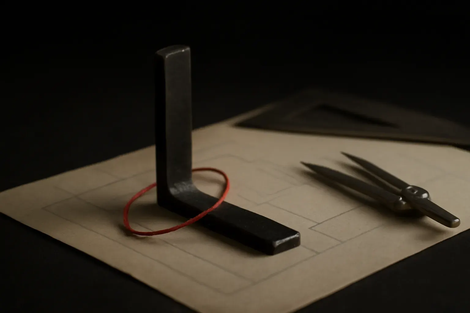
The mark was built from the same two primitives this studio's own identity uses — a hairline rule and a square, right-angle frame — echoing the straight edges and joints of structural ironwork rather than illustrating a hammer or anvil (the literal cliché). Type, colour, and a small set of core applications (sign, invoice, van livery) followed from the mark, not the other way round.
Craft notes


The construction grid for the mark is shown as part of the deliverable, not hidden — the same transparency principle this studio applies to pricing, applied to design reasoning.
Outcome (design intent)
Designed so any future sign, invoice, or packaging can be built on the system without reinventing it each time.
See the service page →Next project
Librairie du Marché →Ready to be the seventh project?
Six were self-initiated. Yours would be the first real one.